Thank you!
12.5.20
We've Moved!
After many excellent years on Blogger, I've moved my site to a super official and fancy new locale. Please visit 2birdstone.com for my up-to-date portfolio and more blogging delights.
21.11.16
Zazzle Holiday 2016: Non-Traditional Style Card Round-Up
This selection of cards is perfect for the family or couple with a modern aesthetic and non-traditional edge. Do you have a pink tree? Do you decorate with all the colors of the rainbow because red and green just aren't fun enough? Then you'll love these fresh takes on the traditional Christmas card and still come away feeling joyful.
 |
| "Inline Peace Everything" by Hooray Creative |
 |
| "Boho Joy Watercolor" by Dahlia Design Co |
 |
| "Holly Jolly" by Christina Novak Designs |
 |
| "Modern Joy" by Hooray Creative |
 |
| "Blue Floral Christmas" by Phrosné Ras Design |
 |
| "Mid Century Ornaments" by 2birdstone |
 |
| "Big Noel" by Andi Pahl |
 |
| "Photo Tree" by 2birdstone |
 |
| "Starlight" by Leah Busch Studio |
 |
| "Fa La La" by Montgomery Fest |
 |
| "Iconic Nativity Scene" by Becky Nimoy |
18.11.16
Zazzle Holiday 2016: Classic Card Round-Up
I know it's still kind of early to be thinking about holiday cards but buying on Black Friday after Thanksgiving or Cyber Monday means you can get them for the best price. To help you get a jump on your card shopping and eliminate what can be a daunting search, I've collected my favorite, new this year, classic holiday cards available on Zazzle.
These designs are traditionally classic with a timeless sense of holiday spirit.
 |
| "Wonderful Year" by Banter & Charm |
 |
| "Wonderful Year in Review" by Banter & Charm |
 |
| "Joyful Dots" by Paper Dahlia |
 |
| "Modern Garland" by Maison Yellow |
 |
| "Vintage Holly" by 2birdstone |
 |
| "Poinsettia Pattern" by Becky Nimoy |
 |
| "Holiday Branch" by Stacey Meacham |
 |
| "Jingle All the Way" by Three Kisses Studio |
 |
| "Traditions" by Fine and Dandy Paperie |
 |
| "Festive Monogram" by Sandra Picco Design |
 |
| "Holiday Blessings" by Sandra Picco Design |
 |
| "Sprinkled Joy" by Jamber Creative |
 |
| "Nutcracker Prince" by Origami Prints |
 |
| "Elegant Evergreen" by k.becca |
 |
| "Red Floral Roses" by Phrosné Ras Design |
 |
| "Colorful Wishes" by Lea Delaveris Design |
 |
| "Red Joy Dala Horse" by 2birdstone |
 |
| "Fireside" by Fine and Dandy Paperie |
 |
| "Typographic Ho Ho Ho" by Amber Barkley |
19.10.16
Quality Product Photography Really Isn't That Hard
Do you think you have to buy styled stock photos to make your products look good? I'm here to tell you, you don't.
For a very long time I was intimidated by product photography and was convinced I couldn't get good results with my old camera and the random doodads around the house. This post is proof that it CAN be done!
Months ago I bought a set of napkins from Minted's home decor line of table linens of my pattern Dotty Chevron in the color "gulf coast." I was curious about the quality and I wanted a set. I even had a product shoot all planned out in my head to promote them.
By "all planned out" I mean I knew I wanted to use the mismatched English china that I collected while we lived in the UK and some gold cutlery that I got on super clearance from Sur la Table. Well, summer came and went and I still hadn't done anything. Last week, I finally decided it was time. After an hour of gathering my supplies and arranging everything just so, I went to turn on my camera and the batteries were dead.
#$%^&@!
After a minor tantrum, I decided to see what I could achieve using my little old iPhone 5. With a little editing in Instagram ... the photos turned out so much better than I ever thought they would!

Pretty, right?
I am a big fan of "behind the scenes" pictures, especially styled product photos so let me give you a little breakdown of the steps I took to get this final image and show you how not intimidating taking these photos really is.
PLEASE NOTE: I am not a photographer. I am not trained in any of this stuff. I just know what I think looks good, what works for me and went with that.
1. Light: Decide what kind of light you want. It was an overcast but not dark day outside which is good for diffused natural light. I didn't use any other light sources. I probably should have propped up some white poster board on my chair to bounce light back into the scene from the bottom. It may have avoided that dark shadowing at the bottom of everything -- oh well!
2. Location: Set up near a North facing window. A photographer I talked to at the Maker's Summit last year told me Northern windows have the best and most consistent indirect light. Using that trick has worked for me so far.
If you have a camera, use a tripod! The tripod is going to be your best friend and keep you from constantly having to adjust your focus and position and give you a consistent frame to work within. I'd also recommend a remote trigger because if you drink too much coffee like me, it can be hard to push the shutter button without moving the camera. You can also try the technique of "push and hold," where you hold down the shutter button for a half second after pushing it to help eliminate any jerking motion that can move the camera.
3. Background: Use a backdrop that gives you the "feel" you want your photo to convey. I used a marble top from an antique dresser of ours (so heavy!) and moved it to the window where I wanted to shoot. Marble makes me think of high-end, clean, kitchens, which is a good backdrop for napkins and tea, no? Plus it reminded me of this humorous post.
4. Product: Think about the product you're photographing. How is it used? What are the characteristics a person using it would be looking for? In the case of these napkins, the pattern is most important with the function and feel second. I made sure to arrange them in a way that shows their potential use and the "feel" the fabric. Having three folded with some cutlery on them gives a sense of how they'll look at a set table while the unfolded one draped across the serving tray gives a sense of the fabric's texture and unfolded size.
5. Accessories: Set the scene with your accessories. Where would you find this product in real life? Gather items that have a variety of textures. A mix of matte, shiny*, metal, wood, stone, and fabric feel visually interesting and realistic. Since I had this lovely gold cutlery, I wanted to tie in more gold so I grabbed china pieces with metallic gold rims, floral elements and in soft, spring colors. I also pulled out two flower shaped brass candlesticks that I'd nabbed from a thrift store last year. In hindsight the candlesticks are not practical with this scene and could be eliminated altogether or replaced with something else more fitting, like a pretty tea tin, tea bags or sugar and cream servers.
*If you use shiny and reflective props, check that your reflection isn't distracting or obvious and for the love of Pete, wear clothes!
6. Composition: First arrange your main product in an interesting way and NOT dead-center (unless that's the look you want). Then sprinkle in your accessory items. I stood on a chair and looked down on the layout so see how items were overlapping and where the visual weight was. Rearrange your items until you get a composition that you like. Use your camera (or in my case, phone) and take some test photos. Look at them in the frame, is your arrangement too centered? Is there a visual path for your eye to travel through the entire image with an emphasis on the main product you are trying to showcase? Are there any weird empty spots or edges where an object is not partially out of the frame or just barely touching? (See how there is an object going off each edge of this photo?) Move stuff around until you get a composition that is visually balanced but not too symmetric.
It's easy to get wrapped up in the adding of things and clutter up your composition so once you've got everything the way you like it, take the Coco Chanel approach to accessories, “before you leave the house, look in the mirror and take one thing off,” and remove one accessory item before settling on a final composition.
7. Take Lots of Shots: More than you think you'll need. I always take a ton of photos, rearrange stuff and take a ton more. Make sure you zoom in on your photos now and then to check your camera's focus is on target. There is nothing worse that taking a gazillion photos and when you go to process them you realize they're out of focus or focused on the wrong thing.
When using a real camera (not a phone) play with the F-Stop and white balance and how much light you are allowing in for each photo. If you can get your lighting spot on while you take the photos you'll eliminate a lot of post-processing time. Keep in mind that your camera settings will need to change as the natural light in your space changes.
When using your phone, tap different areas of the image to see how that affects the overall lighting until you get a look that you want.
8. Edit: Get those photos off your camera and onto your computer and look at them at the size you want them to be viewed. Is your image framed the way you want? Are there any weird little blemishes you can edit out? How's the overall color of the photo? I felt my image was a little dark and cold so I lightened it using Instagram's brightness and warmth filters. A light touch is best when editing your photos this way because it's easy to change the colors of your product and then it's no longer representational of the real thing, which is obviously super bad for product photography.
While this may still seem super overwhelming, it's really a trial and error process and once you get past the "I can't possibly do this" phase into the "wow, I actually made this look good" phase you'll start to see how easy it is to take your own high-quality product photos without a lot of fancy gear and equipment.
Now get out there and give it a shot! If I can do it, I promise you can too.
For a very long time I was intimidated by product photography and was convinced I couldn't get good results with my old camera and the random doodads around the house. This post is proof that it CAN be done!
Months ago I bought a set of napkins from Minted's home decor line of table linens of my pattern Dotty Chevron in the color "gulf coast." I was curious about the quality and I wanted a set. I even had a product shoot all planned out in my head to promote them.
By "all planned out" I mean I knew I wanted to use the mismatched English china that I collected while we lived in the UK and some gold cutlery that I got on super clearance from Sur la Table. Well, summer came and went and I still hadn't done anything. Last week, I finally decided it was time. After an hour of gathering my supplies and arranging everything just so, I went to turn on my camera and the batteries were dead.
#$%^&@!
After a minor tantrum, I decided to see what I could achieve using my little old iPhone 5. With a little editing in Instagram ... the photos turned out so much better than I ever thought they would!
Pretty, right?
I am a big fan of "behind the scenes" pictures, especially styled product photos so let me give you a little breakdown of the steps I took to get this final image and show you how not intimidating taking these photos really is.
 |
| See? My rather unremarkable set-up of the dresser top on on a window seat, counter cleaner and paper towel to remove dust, a desk chair to stand on, cold coffee posing as tea, extra cups and plates, ugly dead grass outside window, and pile of bed pillows on old chair. Normally, my camera and tripod would be here too but I didn't use them for this one. |
PLEASE NOTE: I am not a photographer. I am not trained in any of this stuff. I just know what I think looks good, what works for me and went with that.
2. Location: Set up near a North facing window. A photographer I talked to at the Maker's Summit last year told me Northern windows have the best and most consistent indirect light. Using that trick has worked for me so far.
If you have a camera, use a tripod! The tripod is going to be your best friend and keep you from constantly having to adjust your focus and position and give you a consistent frame to work within. I'd also recommend a remote trigger because if you drink too much coffee like me, it can be hard to push the shutter button without moving the camera. You can also try the technique of "push and hold," where you hold down the shutter button for a half second after pushing it to help eliminate any jerking motion that can move the camera.
3. Background: Use a backdrop that gives you the "feel" you want your photo to convey. I used a marble top from an antique dresser of ours (so heavy!) and moved it to the window where I wanted to shoot. Marble makes me think of high-end, clean, kitchens, which is a good backdrop for napkins and tea, no? Plus it reminded me of this humorous post.
4. Product: Think about the product you're photographing. How is it used? What are the characteristics a person using it would be looking for? In the case of these napkins, the pattern is most important with the function and feel second. I made sure to arrange them in a way that shows their potential use and the "feel" the fabric. Having three folded with some cutlery on them gives a sense of how they'll look at a set table while the unfolded one draped across the serving tray gives a sense of the fabric's texture and unfolded size.
5. Accessories: Set the scene with your accessories. Where would you find this product in real life? Gather items that have a variety of textures. A mix of matte, shiny*, metal, wood, stone, and fabric feel visually interesting and realistic. Since I had this lovely gold cutlery, I wanted to tie in more gold so I grabbed china pieces with metallic gold rims, floral elements and in soft, spring colors. I also pulled out two flower shaped brass candlesticks that I'd nabbed from a thrift store last year. In hindsight the candlesticks are not practical with this scene and could be eliminated altogether or replaced with something else more fitting, like a pretty tea tin, tea bags or sugar and cream servers.
*If you use shiny and reflective props, check that your reflection isn't distracting or obvious and for the love of Pete, wear clothes!
 |
| I realized, after posting this first photo on Instagram, that it was missing a key component. If you are photographing food related items, for heaven's sake, use food or drink in the photo. How stupid does it look to have tea cups with no tea? Also, I didn't love this composition so I switched to a horizontal instead of the square and incorporated more items and a buttered English muffin for good measure. |
6. Composition: First arrange your main product in an interesting way and NOT dead-center (unless that's the look you want). Then sprinkle in your accessory items. I stood on a chair and looked down on the layout so see how items were overlapping and where the visual weight was. Rearrange your items until you get a composition that you like. Use your camera (or in my case, phone) and take some test photos. Look at them in the frame, is your arrangement too centered? Is there a visual path for your eye to travel through the entire image with an emphasis on the main product you are trying to showcase? Are there any weird empty spots or edges where an object is not partially out of the frame or just barely touching? (See how there is an object going off each edge of this photo?) Move stuff around until you get a composition that is visually balanced but not too symmetric.
It's easy to get wrapped up in the adding of things and clutter up your composition so once you've got everything the way you like it, take the Coco Chanel approach to accessories, “before you leave the house, look in the mirror and take one thing off,” and remove one accessory item before settling on a final composition.
7. Take Lots of Shots: More than you think you'll need. I always take a ton of photos, rearrange stuff and take a ton more. Make sure you zoom in on your photos now and then to check your camera's focus is on target. There is nothing worse that taking a gazillion photos and when you go to process them you realize they're out of focus or focused on the wrong thing.
When using a real camera (not a phone) play with the F-Stop and white balance and how much light you are allowing in for each photo. If you can get your lighting spot on while you take the photos you'll eliminate a lot of post-processing time. Keep in mind that your camera settings will need to change as the natural light in your space changes.
When using your phone, tap different areas of the image to see how that affects the overall lighting until you get a look that you want.
8. Edit: Get those photos off your camera and onto your computer and look at them at the size you want them to be viewed. Is your image framed the way you want? Are there any weird little blemishes you can edit out? How's the overall color of the photo? I felt my image was a little dark and cold so I lightened it using Instagram's brightness and warmth filters. A light touch is best when editing your photos this way because it's easy to change the colors of your product and then it's no longer representational of the real thing, which is obviously super bad for product photography.
While this may still seem super overwhelming, it's really a trial and error process and once you get past the "I can't possibly do this" phase into the "wow, I actually made this look good" phase you'll start to see how easy it is to take your own high-quality product photos without a lot of fancy gear and equipment.
Now get out there and give it a shot! If I can do it, I promise you can too.
8.12.15
Minted Art: Zebraba Tile
I'm excited to share that one of my recently launched art prints with Minted has been featured in an email highlighting the Pop Art movement as well as on the gallery wall of a very stylish beauty blogger. I'm pleased to introduce Zebraba Tile ...

In this piece I've combined three of my favorite things: animal subject matter, the contrast of black and white, and repeating pattern. It kind of reminds me of an ink blot but with a tangible subject matter.
Look at this beautifully feminine gallery wall by Teresa of Money Can Buy Lipstick! I love all those blush pink tones. Is it any wonder Pantone choose a soft pink shade as one of its Color of the Year picks for 2016?

All of the links above to Minted are affiliate links. I believe in the quality of Minted's prints and I'm confident in sharing their products with you. If you purchase from one of my links I will make a couple bucks, help a sister out?
shown in daffodil yellow, see more colors here
In this piece I've combined three of my favorite things: animal subject matter, the contrast of black and white, and repeating pattern. It kind of reminds me of an ink blot but with a tangible subject matter.
 |
| Pop Art email from Minted |
Look at this beautifully feminine gallery wall by Teresa of Money Can Buy Lipstick! I love all those blush pink tones. Is it any wonder Pantone choose a soft pink shade as one of its Color of the Year picks for 2016?

photo from Money Can Buy Lipstick, see more soft pink prints here
All of the links above to Minted are affiliate links. I believe in the quality of Minted's prints and I'm confident in sharing their products with you. If you purchase from one of my links I will make a couple bucks, help a sister out?
30.10.15
"Rings" in HGTV Magazine
Big news! One of my very first art prints for sale through Minted, "Rings," is hanging very prominently in a home in this November's issue of HGTV Magazine!


I am pretty stoked to see it, not just in a beautiful home that I could live in, but in the leading full-page spread for the home's tour and again in the background of the portrait of the family. Whoop whoop!


"Rings" is part of a series of four pieces, see them all in my shop.

I love that they tuned this print on its side, it looks so good that way!
Big thanks go out to the Breen family, HGTV Magazine, stylist Christina Wressell and photographer Lisa Romerein; you have no idea how awesome you made my week.
**All Minted links are affiliate links, if you shop via my link I'll get a couple bucks**
5.8.15
Minted Art: Aquamarine No. 2
I opened my email to a happy surprise and saw that Minted featured one of my art prints, Aquamarine No. 2, in their email about color theory and what an analogous color scheme is.
I am particularly fond of this particular color pairing and find myself gravitating toward it often.
The other print in this series is Aquamarine No. 1 and can be found here:

All of the links above are affiliate links. I believe in the quality of Minted's prints and I'm confident in sharing their products with you. If you purchase from one of my links I will make a couple bucks for my copy & paste troubles.

I am particularly fond of this particular color pairing and find myself gravitating toward it often.
The other print in this series is Aquamarine No. 1 and can be found here:
All of the links above are affiliate links. I believe in the quality of Minted's prints and I'm confident in sharing their products with you. If you purchase from one of my links I will make a couple bucks for my copy & paste troubles.
19.12.14
Black and White Geo-Garden Tote Bag
November was a big month for one of my favorite patterns, Geometric Blooms in black and white.

A fellow stationery design friend, Sandra Picco of Sandra Picco Design, selected my Society 6 tote bag for her Friday Faves Black Friday Edition gift guide.
See her whole post and shop the items here.
Another stationery design friend, Renee Pulve of Smudge Design Co., Instagrammed the same tote bag.

7.8.14
Trend Watch: Agates, Geodes and Marbleizing
I don't know about you, but I've been seeing agate stone patterns popping up all over the place. It certainly feels like a growing trend in the home decor sphere and is even creeping into the stationery and art realm.

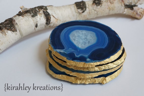
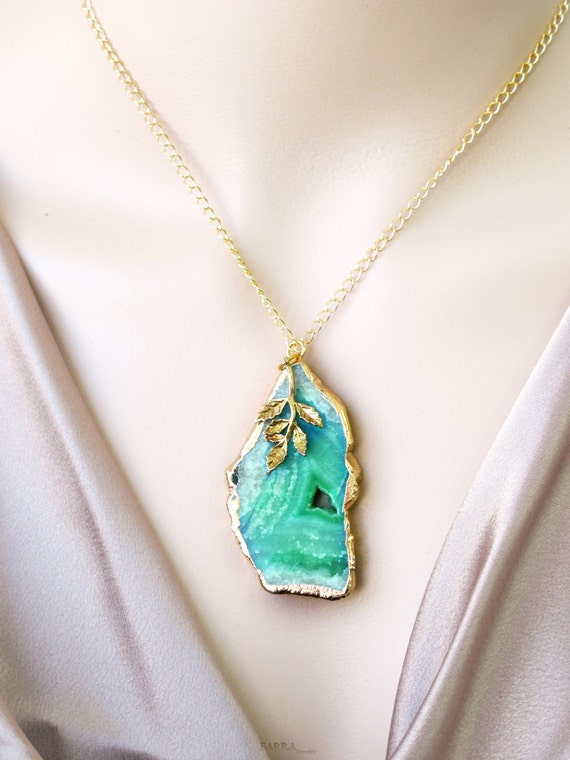
The most obvious way to get a little agate into your life? Buy some actual chunks of the stone and use them as bookends or coasters and dangly window decor. They even make beautiful jewelry!


West Elm is in on the game with these awesome agate bookends
The most obvious way to get a little agate into your life? Buy some actual chunks of the stone and use them as bookends or coasters and dangly window decor. They even make beautiful jewelry!
blue and edged with gold by kirahley kreations
gold-edged, green agate necklace pendant by FARRAjewel
You can get the agate look on your wall with large sheets of hand-marbleized paper. Toss them in a frame and BOOM, instant art!
pretty mantel styling by The Lovely Cupboard
Like this phone case, there are some great products with agate images to be found on Society6.

If you love these gems of nature like I do, check out my Pinterest board devoted solely to the subject, Agate Crystal Gem.
6.8.14
Pretty Desktop Download by Mirdinara for Oh So Beautiful Paper
Ahhh, I totally just downloaded this lovely desktop background from OhSoBeautifulPaper. You must check out Mirdinara's site for more of her intricate and whimsically graphic illustrations!

Subscribe to:
Posts (Atom)