7.8.14

Trend Watch: Agates, Geodes and Marbleizing

I don't know about you, but I've been seeing agate stone patterns popping up all over the place. It certainly feels like a growing trend in the home decor sphere and is even creeping into the stationery and art realm.


West Elm is in on the game with these awesome agate bookends

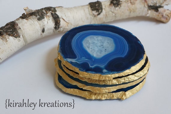
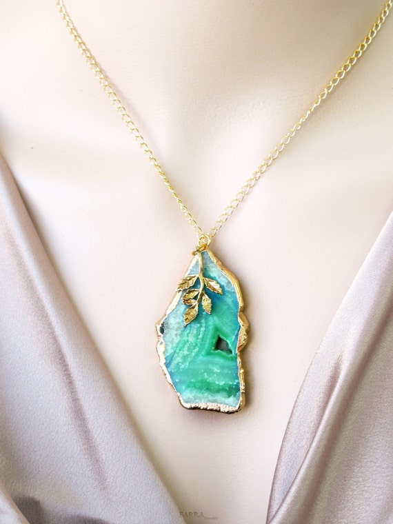
The most obvious way to get a little agate into your life? Buy some actual chunks of the stone and use them as bookends or coasters and dangly window decor. They even make beautiful jewelry!

blue and edged with gold by kirahley kreations


gold-edged, green agate necklace pendant by FARRAjewel

You can get the agate look on your wall with large sheets of hand-marbleized paper. Toss them in a frame and BOOM, instant art!

pretty mantel styling by The Lovely Cupboard

Like this phone case, there are some great products with agate images to be found on Society6.


If you love these gems of nature like I do, check out my Pinterest board devoted solely to the subject, Agate Crystal Gem.

6.8.14

Pretty Desktop Download by Mirdinara for Oh So Beautiful Paper

Ahhh, I totally just downloaded this lovely desktop background from OhSoBeautifulPaper. You must check out Mirdinara's site for more of her intricate and whimsically graphic illustrations!


5.8.14

Super Fun Bedsheets for Adults DO Exist!

I just finished making up the master bed and I thought to myself, "man, why are there no fun, patterned sheet sets for adults?" I knew West Elm had good patterned sheet sets and some cool, patterny duvet covers but I wanted to find polka dotted sheets in fun colors that were bright and fun but wouldn't scream "I still sleep in a queen because they make super hero sheets this size" or "I'll never grow up, mortgage be damned!"

While it's easy to find wild and colorfully patterned duvet covers and shams but I prefer the "fun" to be inside the bed. I'd rather the room feel soothing and like a welcome place to rest but with a secret. Like a fruity candy filling inside a classic and reserved chocolate shell. When you peel back the covers of the bed it's like a happy surprise. If only Willy Wonka designed bed linens ...

Curiosity sent me on an immediate mission to prove myself wrong. In the latest issue of HGTV Magazine I had seen a cute kids bedroom with white on yellow polka dotted sheets from Land of Nod, so I started there.


What a glorious selection of fun patterns and colors! Here are my more adult favorites (come on, I'd love those stars and lightning bolts but the other half would very quickly veto them) from Land of Nod, though keep in mind they only go up to Queen size.

like a classic wool suit with a twist, the aptly named, Dapper


large white dots on navy are the preppy cool New School


Fashionista is a girly take on a hand-made graphic pattern

Mixed with rich solid colors, layered neutrals or even complimentary ethnic prints these sheets can easily go from kiddie to cool.

Emboldened by these finds in the kids department I ventured forth with the obvious Google search "fun bed sheets for adults." When the top result was The Company Store, I smacked my forehead, DUH!

Orb Moonshadow has a lovely color palette


the delightfully mid-century Carson

so fun and bright, I love these graphic Calypso Fish for summer or that dream beach house

If you're willing to shell out some more money for sheets Pine Cone Hill also has some colorful and fun options. To look at.

adult but still cool, Watercolor Dots


super fun Lyric Paisley


Parma is ornate but not stuffy

I am delighted to report that there are many sources for fun bedding out there. An immediately obvious source is the ever delightful, Marimekko brand. You can find a good variety at FinnStyle here, and a few more at Crate and Barrel here.

Here is a little list of other blog bedding round-ups and sites to find fun stuff:
2. Snurk Bedding: visual trickery and funny duvet covers
3. Society6 has gotten in on the bedding game with artist made duvets
4. All Modern has some gems in their bedding section with solid brights, ogee pattern, a super cool water splash pattern and many varieties of stripes, dots and even color-blocking.
5. Pottery Barn teen won me over with the fun cheetah, paisley, plaids and rugby stripe.
6. TrendHunter is really on the ball with humorous and fast food inspired finds.

Why should kids have all the fun anyway?

17.3.14

A Hot Pink Hello Zebra Desktop

How fun is this?! I saw this free desktop wallpaper on Pinterest and had to download it. I love how cheery and bright the pink is and the whimsy of the zebra illustration.


 Design by Fabulous K -- add a little cheer to your desktop here.

11.3.14

That's One Cool Kid - birth announcements round-up

It's finally beginning to feel like spring! I don't know about you, but I have a TON of pregnant friends, most of whom are due with Spring babies. You know what that means? Announcing the big news to friends and families once the tiny bundles of joy arrive.

Here's a little round-up of my favorite baby announcements for new moms and dads to-be:

Pretty gold hearts and delicate calligraphy make this Welcome Bliss announcement elegant and sweet.


 I LOVE this print by Vera Bradley and now it's available on the Blooming Baby announcement!


For the type lover this Cutely Curved announcement helps your little one shine.


Check out this super cute, nursery rhyme inspired announcement From the Nursery -- I cannot get over that sweet little cow!


A delicate and classic mix of modern fonts and sweet bow perfect for a Little Lady.


Cool Kid has an infographic vibe for a modern and colorful take on the birth announcement.

Your photo is the focus with this simple and modern text based announcement.

Delicate blossoms and elegant type make your photo the center of attention of this Charming Floral design.

Bring a little nature to your message with a Cute Red Fox alongside your cute new baby.

26.2.14

Sneak Peek! Baby Shower and Announcements Coming Soon to Minted.com

I just love when a slightly crazy idea comes together AND resonates with lots of people. These three designs will be added to Minted's baby collection this spring.

Baby shower invitation, Inky Screen:


and the Cool Gal and Cool Guy birth announcements:


I'll be sure to update when they're up for sale!

25.2.14

Client Spotlight: Shanna Russell

It's been a long time since I shared a client project with you. This one is a bit of a departure from the stationery items that I frequently post. This time a good friend asked me to create a couple custom art prints for her first child's nursery.

Shanna and I met while living in England. She's an independent creative like myself working as a photographer. She is the genius behind the lens of many of the "stock" photos I use in my shops and has taken the very best pics to date of me, my hubs and our pup. While she lives in Idaho now, she wanted to imbue her son's nursery with a sense of adventure and love of travel.

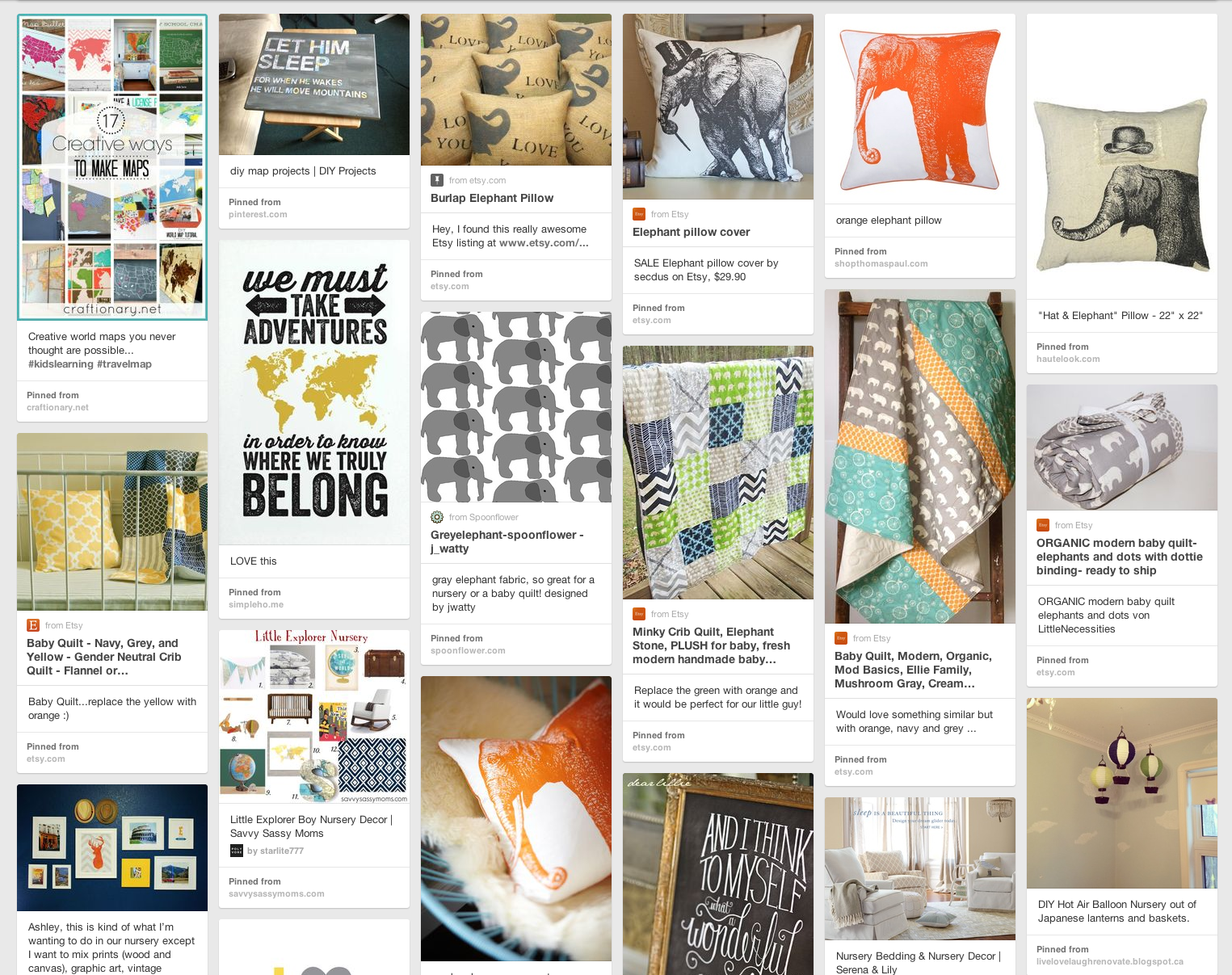
Our first step toward collaboration was the Pinterest board she'd created of inspiring images.


I LOVE when clients do this, it gives me such a great sense of their aesthetic and the kinds of elements and colors that they are drawn to. I prefer the "show me" angle Pinterest allows so much more than the "tell me" of written notes.

With all of that visual stimuli in mind and her request for the "oh, what a wonderful world," quote, I was off to the digital drawing board. I knew I had to do something with a globe for the travel aspect and figured the quote would go well with that image. I also wanted to pay homage to the Russell's roots in Texas, where I knew there had to be a legion of adoring baby Russell fans just waiting to shower their love upon the little one. Shanna wasn't convinced because she had never seen any "Texas art" that she loved (this girl has the best taste, I can't say I was very surprised to hear that). Challenge accepted.

Fast forward ... check out the final prints and her chic nursery.


How cool is that vintage camera?! (Awww, big brother Chuck loves that sheepskin!)

What a sweet little corner of handmade goodness and family heirlooms.

So clever to put baby shower notes and foreign coins under a class side-table top. Plus, how cool is that textured lamp?

Sweet chevrons in blue, grey and orange. 

An old dresser is given new life as a changing table with a coat of rich glossy blue paint and new handles.

 One last look at the knock-out nursery!

Don't forget to check out Shanna's Pinterest  for tons of style inspiration and and follow her page on Facebook to keep up with her wonderful photographic work.

1.2.14

Sneak Peek! Elegant Peacock: a hand-illustrated wedding invitation

There seems to be a pretty strong trend in the wedding world of using peacock feathers as part of wedding decor as well as using one of nature's most elegant color combinations. Brides the world over are inspired by the rich jewel tones of the male peacock's finery and his majestic silhouette.


If you follow me on Instagram you may remember this pic, taken of some drawings I was working on.


Well, that peacock had been living inside my head for months. I had this vision for a peacock "themed" wedding invitation that was different than any I'd seen before but the problem was trying to get it from my head onto the computer without it looking cheesy. So I collected a bunch of peacock images to give me some ideas for composition and to get the details right.


[I'm working on source references now, hold tight!]


After the initial sketch, I used some tracing paper to clean up and further develop the illustration finally ending with finished drawing which I outlined using a fine point Sharpie. Using the magic of my scanner and Adobe Illustrator my sketch was in the computer and ready for "design-ification."

After some awesome community-suggested tweaks, Elegant Peacock was on it's way to an Editor's Pick. Woooo hoooo!


There is that little green star again!


While the full invitation suite hasn't launched quite yet, here's a sneak peek at what the whole thing will look like. 


While I anxiously await the launch of my Elegant Peacock invitation suite, I know there will be a whole collection of other amazing wedding designs to come. You can get a sneak peek of the other selected designs at the winner's page on Minted right now.


While this post contains some Affiliate links, I am really just super excited to show you the fruits of my hard work! If I make a little commission from some shopping via these links I'll consider it a generous bonus. Thanks for reading!

30.1.14

Modern Belle: a classy letterpress invitation

I am super excited to announce that one of my design entries for the first-ever letterpress wedding invitation challenge at Minted was chosen to be part of the Spring 2014 line!

Check it out! (I love that little green star.)


Living in the South (North Carolina is in "the South," right?) I know how the Southern ladies love their bright colors and fun patterns. I wanted to create a wedding invitation suite that would appeal to the "Southern Belle" that was at once classy and fun in a modern and not too sweet kind of way. In the end, I was inspired by the ever-popular chevron motif and challenged myself to create an invitation that would appeal to both the bride planning a breezy beach wedding as well as the bride planning a wedding on a sumptuous Southern plantation.

My vision looks a little like this inspiration board.


I've been working on the remaining elements of the suite, trying to keep it classy but still integrate the fun chevrons in each element. This is where I ended up.


The suite will be available in one, two and three-color versions giving you the ability to choose each color you'd like from Minted's palette of letterpress inks.

30.12.13

Before + After: Front Door

With all the changes going on in the inside of our new home, I wanted to do something small but with big impact to make the house feel more like ours from the outside. While we will probably repaint it in the next couple of years, it's not at the top of our list for now. I opted instead to change the front door color. Front door colors are kind of like lipstick, a color can change the whole look.

Our house started with a plain white front door on the outside. When I spotted this front door in my first HGTV magazine (July 2013) I knew that something bright and cheery was just what the house needed to feel like "ours."

That is seriously cheery, right? [source]

Initially, I had a tough time narrowing it down to one choice. The Pantone paint selection at Valspar has a ton of saturated brights so that's where I pulled my chip choices from. There were about 5 paint chips taped to the front door for two months while I debated. It came down to two so we decided to paint the lighter color first for ease of painting over it with something stronger if it didn't feel right.

The final choice? Pantone's Bay from Lowe's. It's a soft and minty sea green that looks pretty with the grey exterior and black and white trim.


As for tips and tricks, this was pretty straight forward. Just remember to remember how your door handle and dead bolt lock go back together. I left the door on the hinges because they were too hard remove and wiped down the door to get dirt and grime off before painting and didn't prime it. I bought a quart of paint and that was more than enough for two coats.

While I was feeling super productive I decided to sand part of the jamb surface of the door that had been sticking when closed. While it helped the door close easier the sander "grabbed" the painted surface of the interior of the door and peeled off a huge chunk of the interior coat of paint. Boo! Down the rabbit hole I went ...

With large swaths of latex paint peeled off and the primer exposed I had to tackle the new eyesore. Rather than try to re-paint over the primer that seemed suspect (given how easy it was to pull large sheets of paint off) I opted to strip it down to the original wood.

Enter Citristrip, my new favorite paint stripper. Not only can you use it inside, you don't have to wear a mask to protect you from the fumes. Score! I did wear eye protection though. Two trips to the doctor for stripper/sand in the eye was enough motivation to avoid another incident. 

The tools I used were: nitrile gloves, a new plastic putty knife, a plastic drop cloth over a canvas one (just in case, I'm clumsy), lots of wooden skewers for cranny strippy (not Granny stripping -- you creep), an old brush, a wide-mouthed jar and Citristrip. You'll also want some paint thinner to clean the wood surface of excess stripper and any last stubborn bits of paint. Beware of where the stripper and paint thinner are at all times, you don't want any stray drops contacting anything other than what you want stripped -- it will affect the surface it touches.


Stripping in progress. Coat the surface with an old paint brush and the stripper and then stick a cut open plastic bag against the surface and wait. The plastic bag helps the stripper to stay moist and really helps with peeling the paint off. You'll also want to use the points of the skewers to scrape all the paint bits out of the corners of the moulding details.


The paint on the door was hiding some patched areas and quite a few dings and dents. Luckily, I dig it. Eventually, I'll be tackling the stairs with a fresh coat of dark chocolate stain on the tread surfaces and the railing and painting the spindles to match the house trim. My plan is to use the same stain from the stairs on the door to tie it all together for a cohesive entryway.

**UPDATE** I have finally stained the inside of the front door. Mr wasn't into my idea of black stain so I went next darkest and bought a little can of Rustoleum in Kona. I did one liberal coat of stain with a cheapie 3 inch foam brush and then wiped up the excess with rags. I did let the stain sit on the surface for a little bit before wiping to really let that dry wood soak it up. There are a couple imperfections in the door surface where the stain didn't take so well but for now I'm leaving them and calling it "rustic." After about four days of drying I bought a can of poly sealer but I've not put it on yet. I like the feel of the raw wood but I think I'll do one coat of matte for good measure. I didn't take the door down (again) so we'll see if I can do it without getting too many drips and runs.